
University of Calgary Marketing Collateral
A body of promotional design, photography, and video for the University of Calgary's School of Architecture, Planning and Landscape, supporting public-facing events, campaigns, and day-to-day communications. Took an existing SAPL pattern, built from isometric cube facets, apart and rebuilt it into new derivative forms across the work, a thin triangular line-art grid on posters and other visual assets, solid triangular color blocks for footers and corner accents, reapplied by program, by publication, and by audience
Role: Creative Direction, Graphic Design, Photography, Videography.
Tools: Adobe Illustrator, Adobe Photoshop, Adobe InDesign.
Marketing Collateral
Education
Graduate Recruitment Campaign
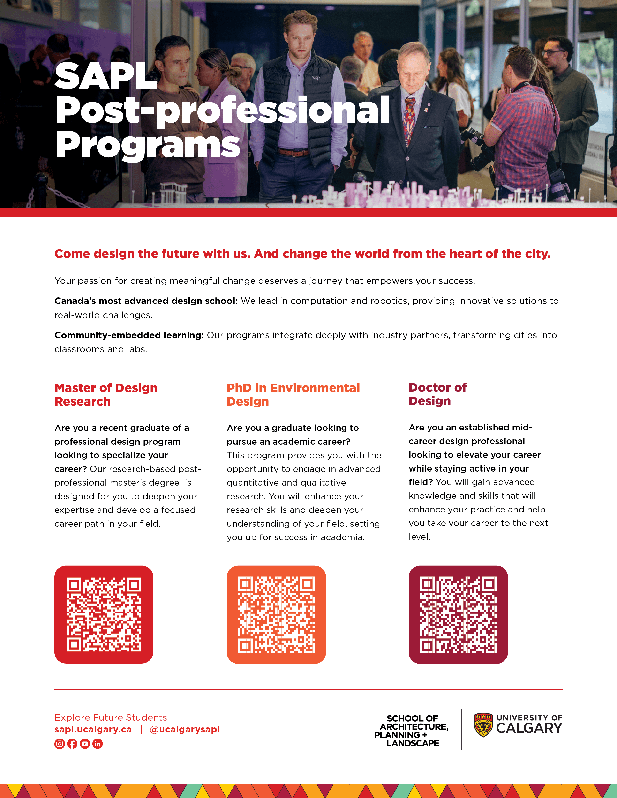
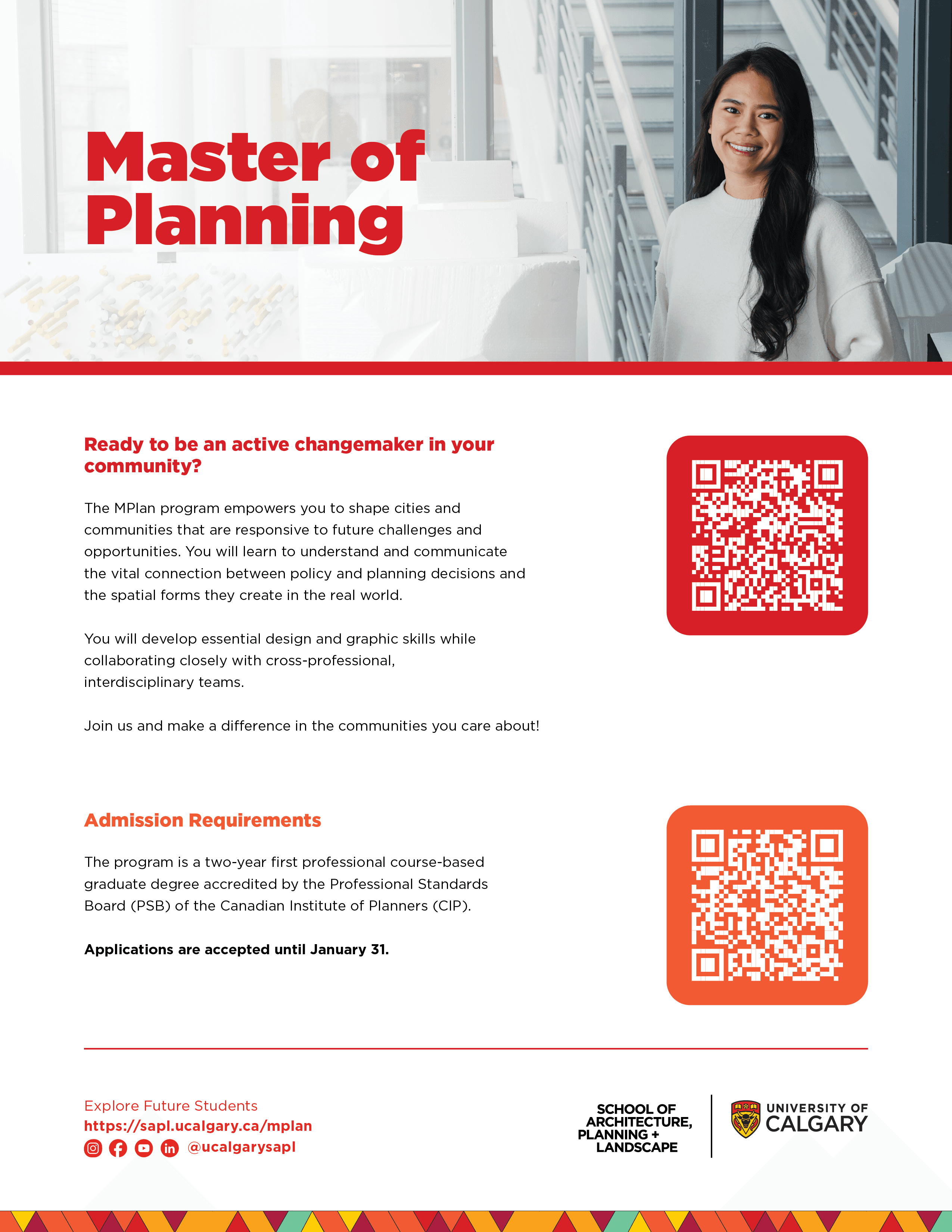
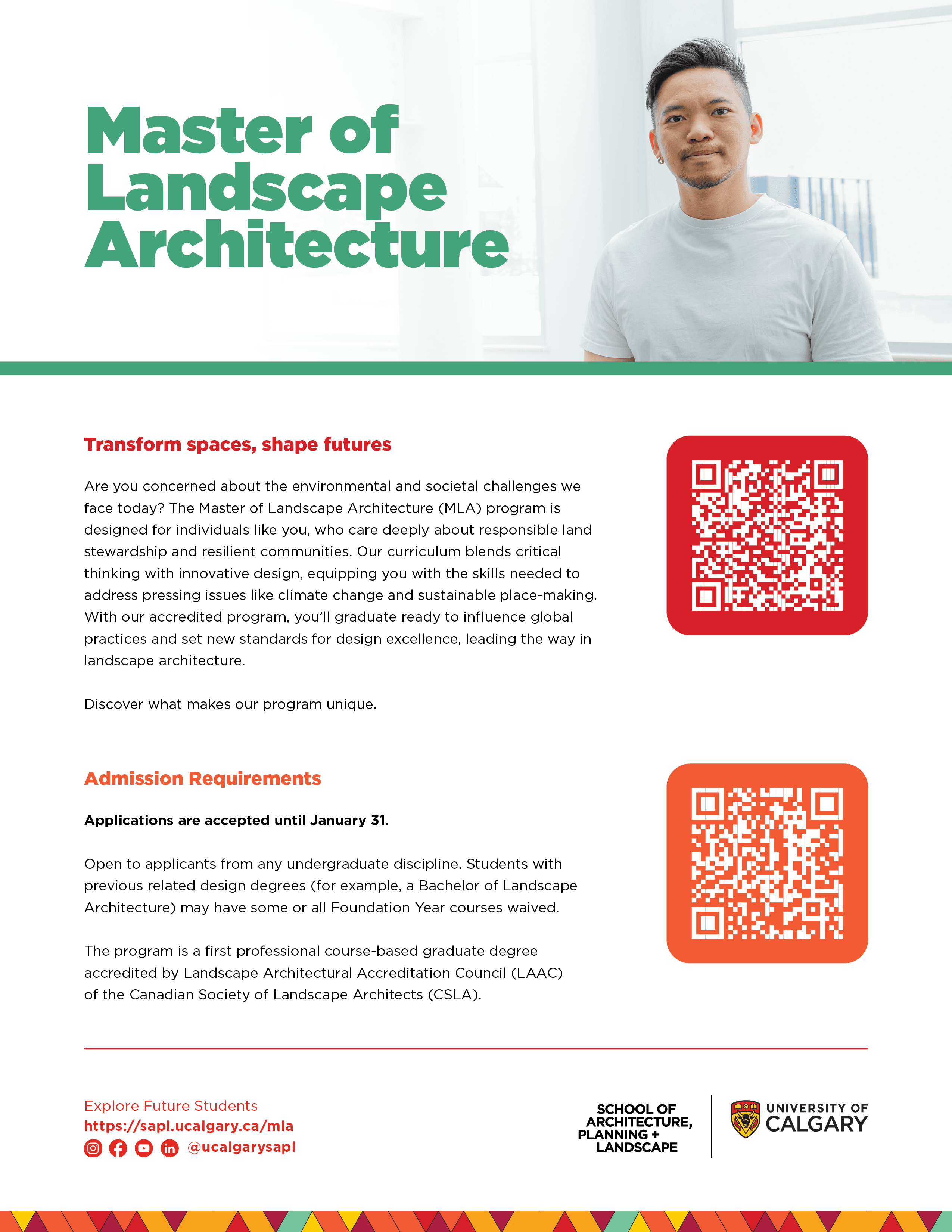
Four grad programs, one recruitment push.
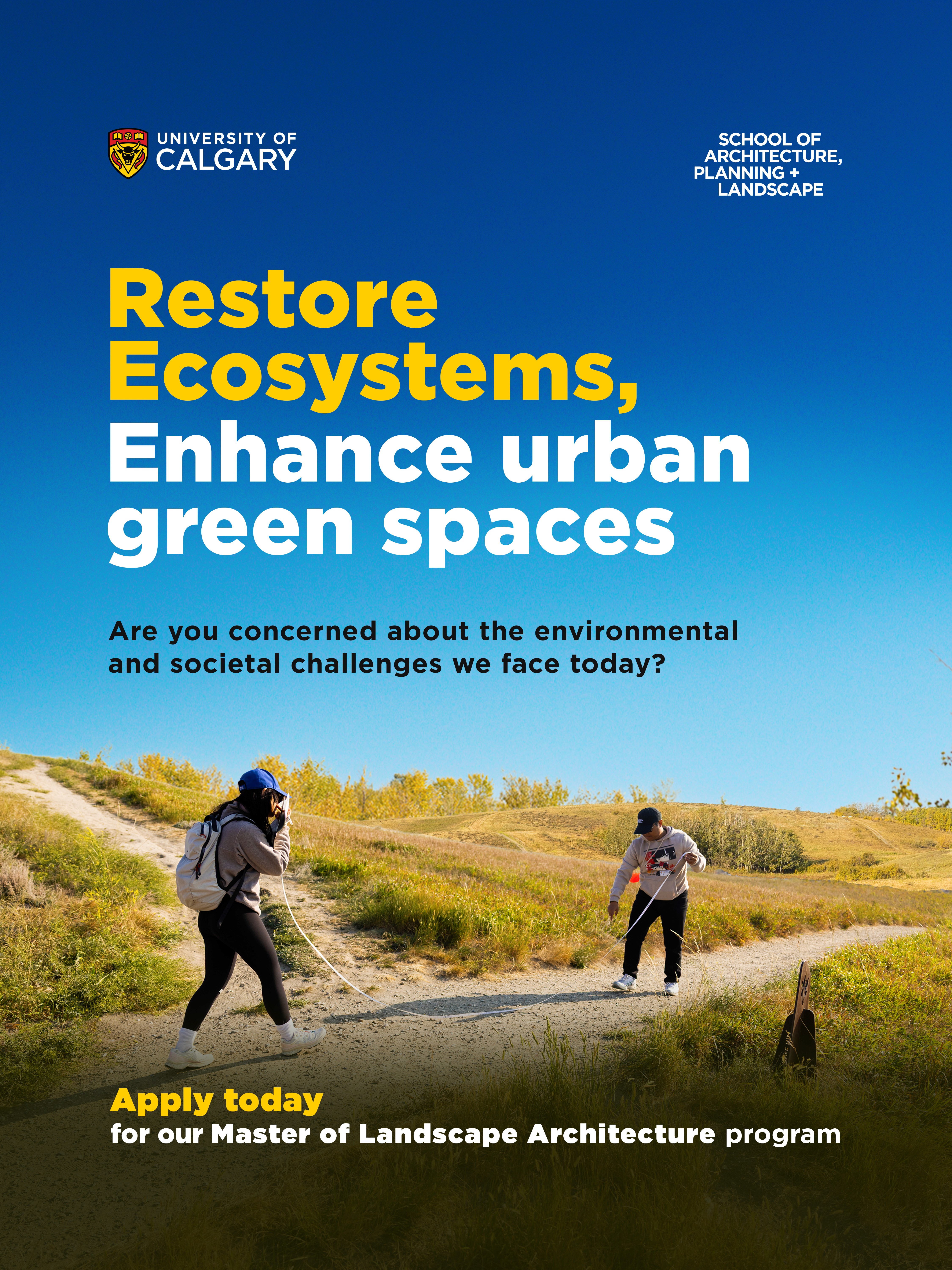
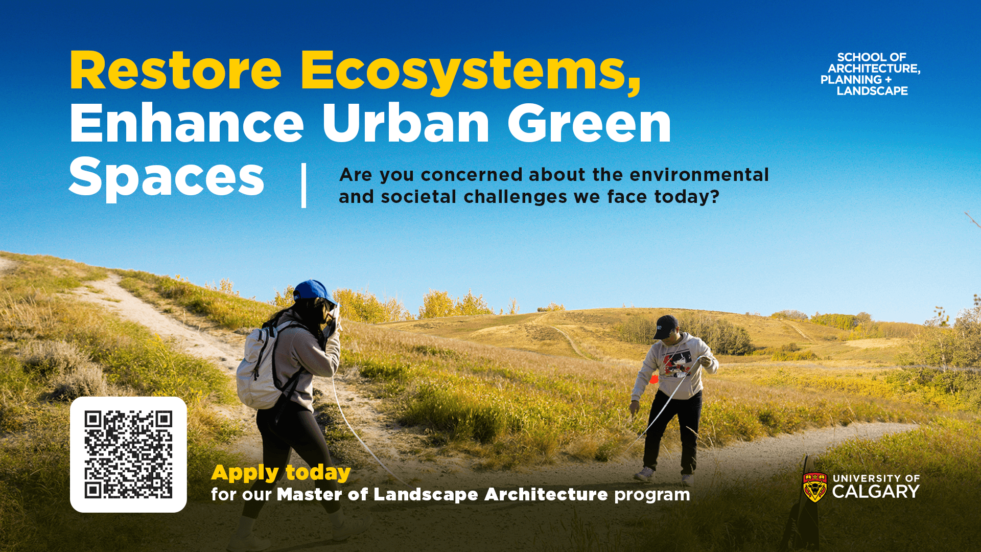
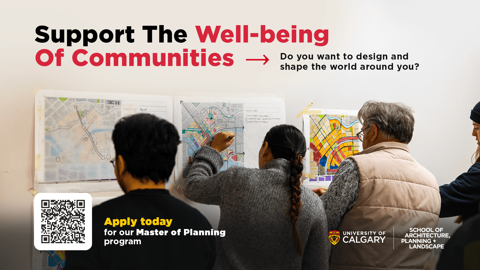
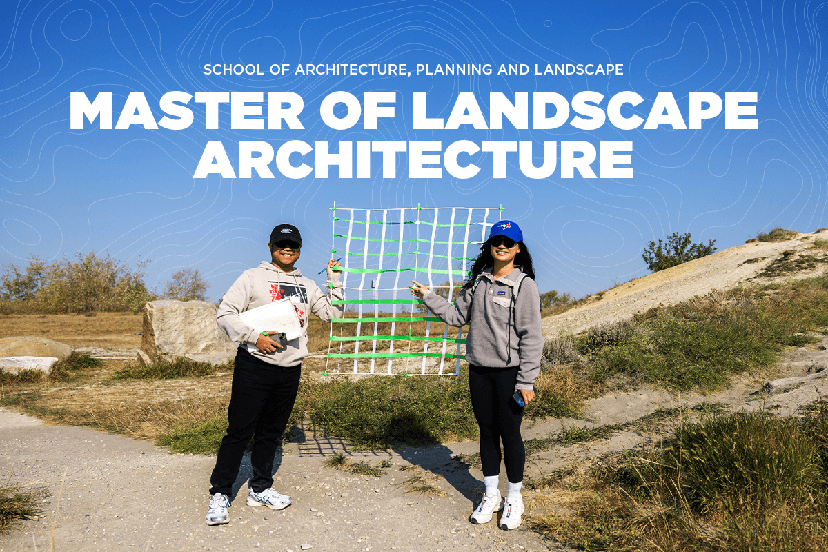
Put them all under one look and they blur together. Spread them too far apart and it stops feeling like one school. So each program got its own color and its own photography, chosen to match what the words were already saying, robotics and fabrication behind a line about innovation, students working through a community master plan behind a line about community well-being, landscape students out with measuring tape and irrigation flags behind a line about restoring ecosystems. To someone who's never set foot in the program, a name on a poster doesn't mean much on its own, the photography showed what the work actually looks like, instead of leaning on stock imagery that could belong to any school. Alongside that ran a second set covering all four programs at once, for when the message was about the School, not one program. Tone changed with the calendar too, calmer early on, more urgent as the deadline got close. Built to get the right prospective student to stop and actually consider applying, not just recognize the School's name.













Communications Assets
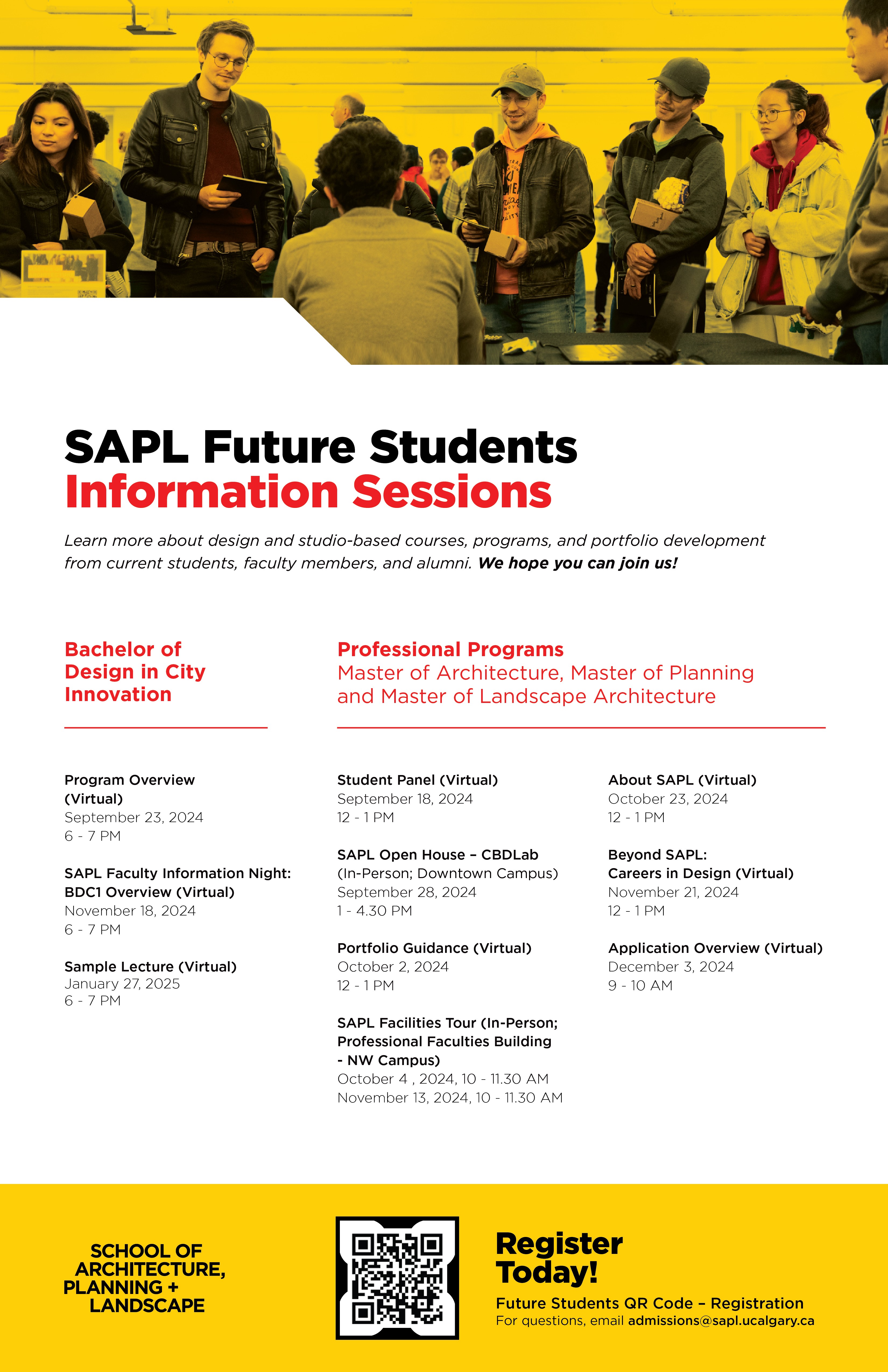
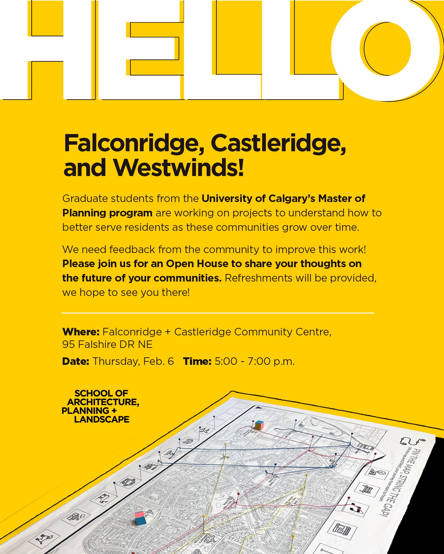
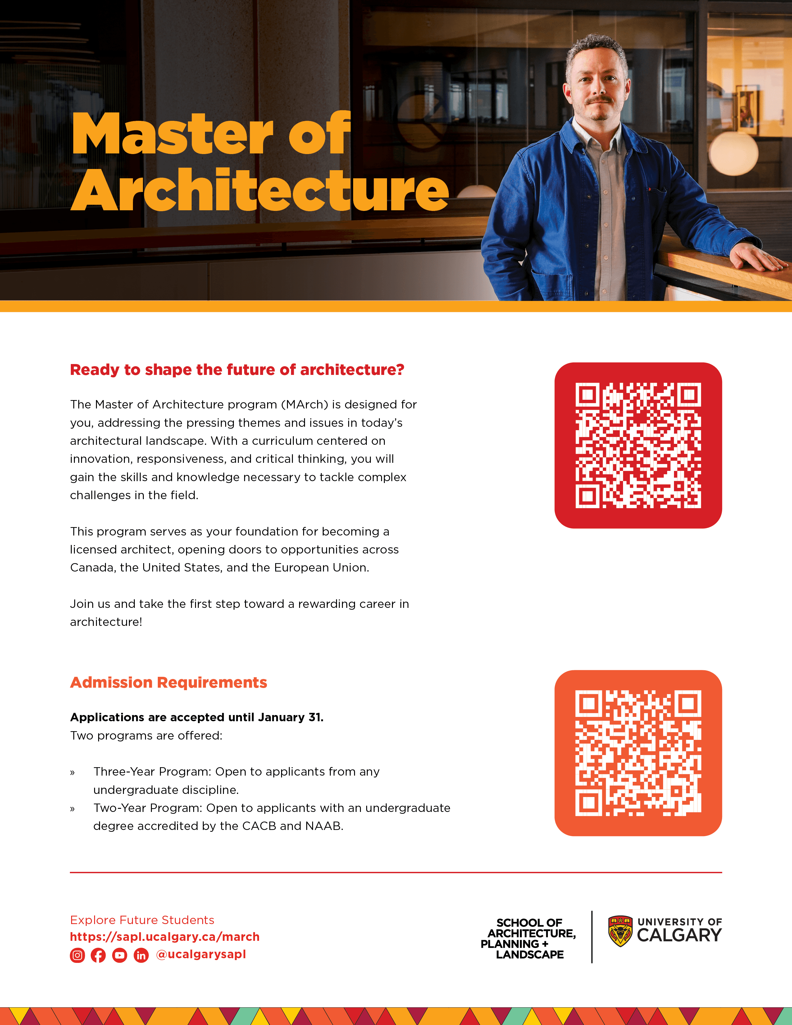
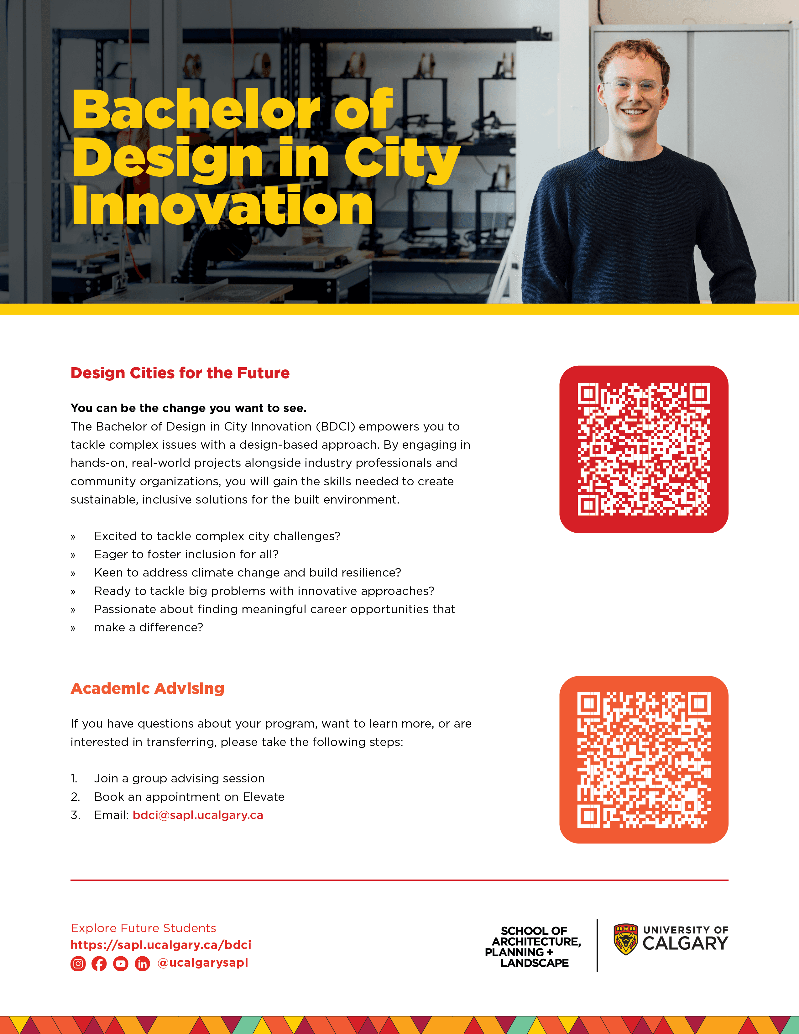
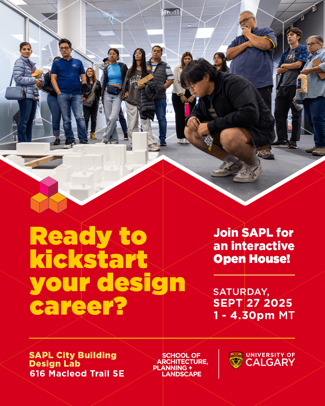
Posters, social assets, and flyers for the Faculty's ongoing communications.
Recruitment, events, program announcements, general awareness, the steady output a faculty needs to stay visible year-round.
















Digital Touchpoints
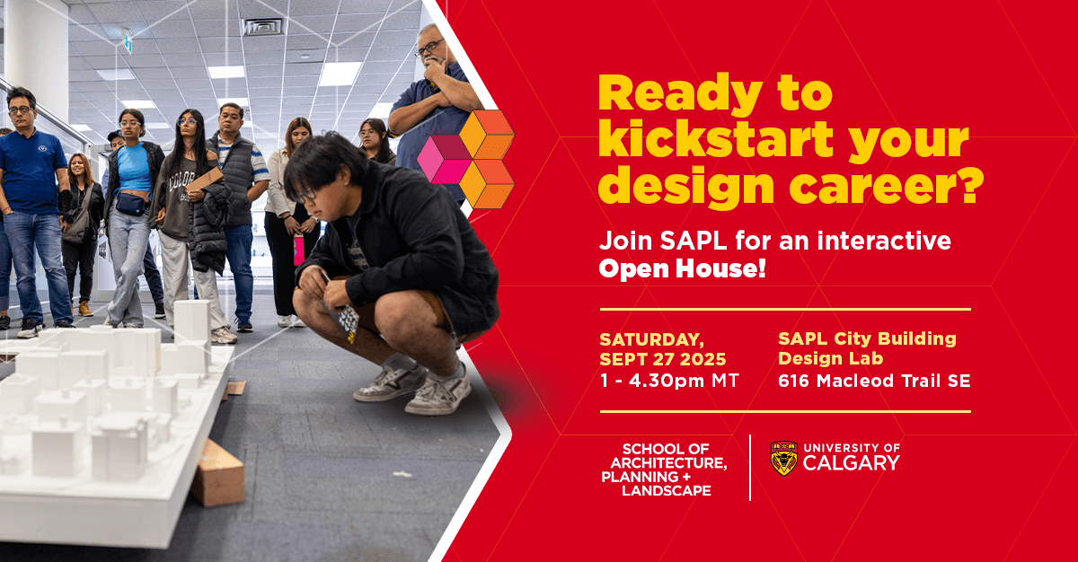
High-contrast color, full saturation, type that takes up space
Bold, optimistic, in UCalgary's brand colours, in the spirit of SAPL's own line, "Bold thinking for the built environment." Web banners, email banners, social media, newsletters, Yodeck screens, EBBs, dozens of initiatives a year. A few were designed to be recycled templates but each piece had its own audience even inside the same visual family, keeping SAPL and UCalgary visibly present at every touchpoint someone might run into it, not just the big campaign moments.
























Professional Audience Campaign
Editorial and advertising work for the Doctor of Design program, built majorly for mid-level career practicing professionals.
The talent pairing wasn't random: Dr. Teresa Goldstein, a planner, ran in CIP - Plan Canada magazine; Dr. Darryl Condon, an architect, ran in Canadian Architect magazine, both spring (April) 2026 Issue. Each one paired with their real city skyline, so it felt specific instead of stock.
The look changed on purpose too. Black and gold instead of the red-and-yellow used for student recruitment, a premium, mature palette built for a professional audience. The skyline sits behind each subject rather than beside them, so the city reads as backdrop to their career, not decoration. The layout was built as a template on purpose, so scaling to new alumni or new publications later would only mean swapping the person and the city, not redesigning from scratch.
SAPL trains architects, planners, and landscape architects, so the campaign covered all three. The boardroom photo, the cohort mid-discussion, stood in for the program itself and ran as the core creative for CSLA and Canadian Architect's digital ad. The individual portraits carried the peer credibility instead, Goldstein for Plan Canada, Condon for Canadian Architect. The postcard split the same way, Dr. Condon's portrait on the front, the boardroom photo on the back with full details about the program, "this person made it" giving way to "this is the room you'd be walking into."
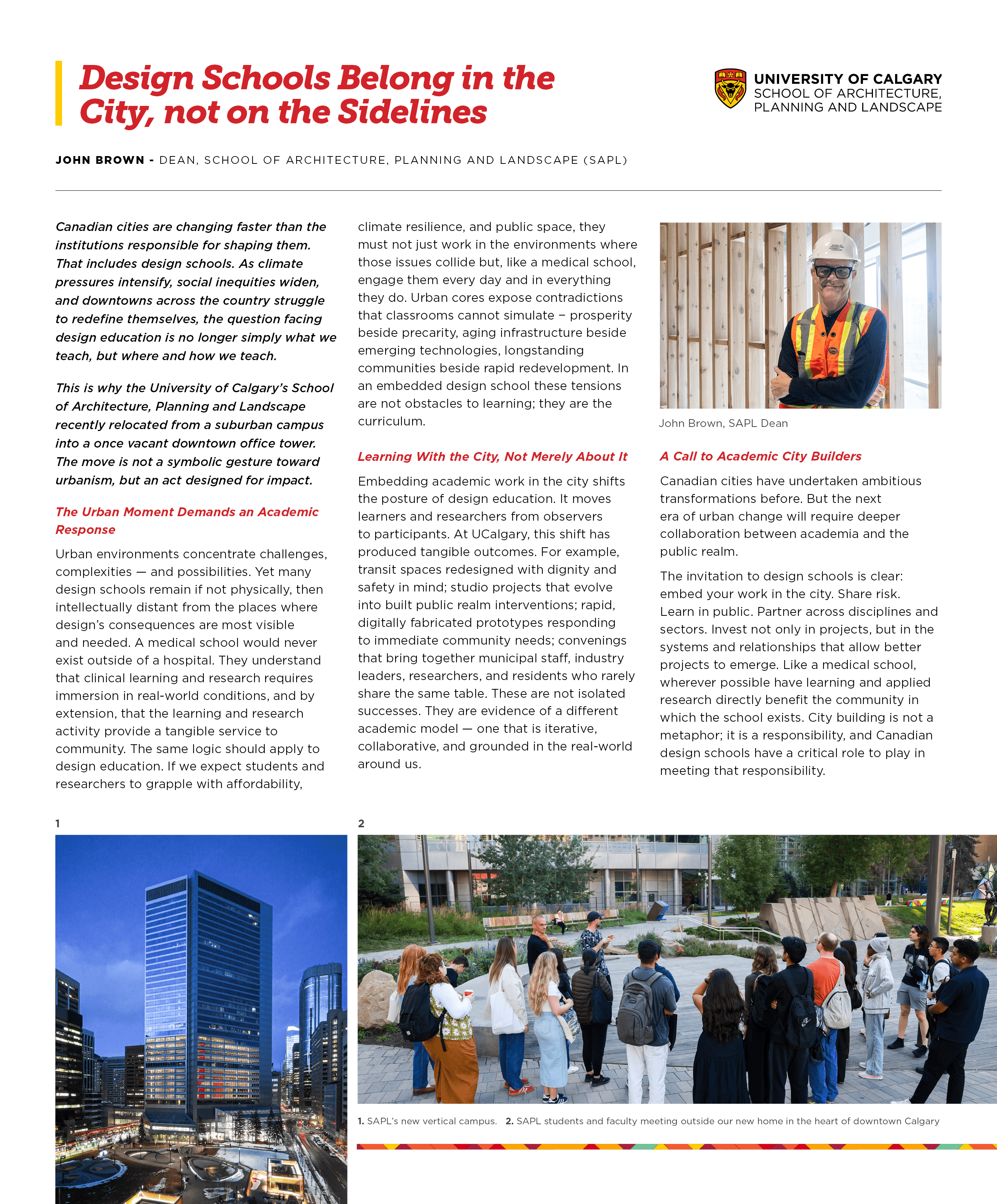
An op-ed for Canadian Architect, "Design Schools Belong in the City, Not on the Sidelines," sat alongside all of it. Entirely different craft, pull quotes, byline treatment, a reading rhythm built for a magazine page rather than a feed. Framed as the Dean's own take, not as an ad for the School.




Promotional Videos and Testimonials
Promotional Videos and Testimonials
Promotional Videos and Testimonials
Real People, Real Stories.
Shot and directed on location, camera, lighting, and framing handled hands-on for every subject. Most weren't used to being on camera, so where the lens sat, how someone was lit, what location backed them, a studio for a student, an office for an industry professional, had to do the work a trained performer would otherwise do themselves. Edited by Justine Kim, who shaped the footage into its final pace and structure in post.
More Works


University of Calgary Marketing Collateral
A body of promotional design, photography, and video for the University of Calgary's School of Architecture, Planning and Landscape, supporting public-facing events, campaigns, and day-to-day communications. Took an existing SAPL pattern, built from isometric cube facets, apart and rebuilt it into new derivative forms across the work, a thin triangular line-art grid on posters and other visual assets, solid triangular color blocks for footers and corner accents, reapplied by program, by publication, and by audience
Role: Creative Direction, Graphic Design, Photography, Videography.
Tools: Adobe Illustrator, Adobe Photoshop, Adobe InDesign.
Marketing Collateral
Education
Graduate Recruitment Campaign
Four grad programs, one recruitment push.
Put them all under one look and they blur together. Spread them too far apart and it stops feeling like one school. So each program got its own color and its own photography, chosen to match what the words were already saying, robotics and fabrication behind a line about innovation, students working through a community master plan behind a line about community well-being, landscape students out with measuring tape and irrigation flags behind a line about restoring ecosystems. To someone who's never set foot in the program, a name on a poster doesn't mean much on its own, the photography showed what the work actually looks like, instead of leaning on stock imagery that could belong to any school. Alongside that ran a second set covering all four programs at once, for when the message was about the School, not one program. Tone changed with the calendar too, calmer early on, more urgent as the deadline got close. Built to get the right prospective student to stop and actually consider applying, not just recognize the School's name.
Communications Assets
Posters, social assets, and flyers for the Faculty's ongoing communications.
Recruitment, events, program announcements, general awareness, the steady output a faculty needs to stay visible year-round.
Digital Touchpoints
High-contrast color, full saturation, type that takes up space
Bold, optimistic, in UCalgary's brand colours, in the spirit of SAPL's own line, "Bold thinking for the built environment." Web banners, email banners, social media, newsletters, Yodeck screens, EBBs, dozens of initiatives a year. A few were designed to be recycled templates but each piece had its own audience even inside the same visual family, keeping SAPL and UCalgary visibly present at every touchpoint someone might run into it, not just the big campaign moments.
Professional Audience Campaign
Editorial and advertising work for the Doctor of Design program, built majorly for mid-level career practicing professionals.
The talent pairing wasn't random: Dr. Teresa Goldstein, a planner, ran in CIP - Plan Canada magazine; Dr. Darryl Condon, an architect, ran in Canadian Architect magazine, both spring (April) 2026 Issue. Each one paired with their real city skyline, so it felt specific instead of stock.
The look changed on purpose too. Black and gold instead of the red-and-yellow used for student recruitment, a premium, mature palette built for a professional audience. The skyline sits behind each subject rather than beside them, so the city reads as backdrop to their career, not decoration. The layout was built as a template on purpose, so scaling to new alumni or new publications later would only mean swapping the person and the city, not redesigning from scratch.
SAPL trains architects, planners, and landscape architects, so the campaign covered all three. The boardroom photo, the cohort mid-discussion, stood in for the program itself and ran as the core creative for CSLA and Canadian Architect's digital ad. The individual portraits carried the peer credibility instead, Goldstein for Plan Canada, Condon for Canadian Architect. The postcard split the same way, Dr. Condon's portrait on the front, the boardroom photo on the back with full details about the program, "this person made it" giving way to "this is the room you'd be walking into."
An op-ed for Canadian Architect, "Design Schools Belong in the City, Not on the Sidelines," sat alongside all of it. Entirely different craft, pull quotes, byline treatment, a reading rhythm built for a magazine page rather than a feed. Framed as the Dean's own take, not as an ad for the School.
Promotional Videos and Testimonials
Real People, Real Stories.
Shot and directed on location, camera, lighting, and framing handled hands-on for every subject. Most weren't used to being on camera, so where the lens sat, how someone was lit, what location backed them, a studio for a student, an office for an industry professional, had to do the work a trained performer would otherwise do themselves. Edited by Justine Kim, who shaped the footage into its final pace and structure in post.
More Works
University of Calgary Marketing Collateral
A body of promotional design, photography, and video for the University of Calgary's School of Architecture, Planning and Landscape, supporting public-facing events, campaigns, and day-to-day communications. Took an existing SAPL pattern, built from isometric cube facets, apart and rebuilt it into new derivative forms across the work, a thin triangular line-art grid on posters and other visual assets, solid triangular color blocks for footers and corner accents, reapplied by program, by publication, and by audience
Role: Creative Direction, Graphic Design, Photography, Videography.
Tools: Adobe Illustrator, Adobe Photoshop, Adobe InDesign.
Marketing Collateral
Education
Graduate Recruitment Campaign
Four grad programs, one recruitment push.
Put them all under one look and they blur together. Spread them too far apart and it stops feeling like one school. So each program got its own color and its own photography, chosen to match what the words were already saying, robotics and fabrication behind a line about innovation, students working through a community master plan behind a line about community well-being, landscape students out with measuring tape and irrigation flags behind a line about restoring ecosystems. To someone who's never set foot in the program, a name on a poster doesn't mean much on its own, the photography showed what the work actually looks like, instead of leaning on stock imagery that could belong to any school. Alongside that ran a second set covering all four programs at once, for when the message was about the School, not one program. Tone changed with the calendar too, calmer early on, more urgent as the deadline got close. Built to get the right prospective student to stop and actually consider applying, not just recognize the School's name.
Communications Assets
Posters, social assets, and flyers for the Faculty's ongoing communications.
Recruitment, events, program announcements, general awareness, the steady output a faculty needs to stay visible year-round.
Digital Touchpoints
High-contrast color, full saturation, type that takes up space
Bold, optimistic, in UCalgary's brand colours, in the spirit of SAPL's own line, "Bold thinking for the built environment." Web banners, email banners, social media, newsletters, Yodeck screens, EBBs, dozens of initiatives a year. A few were designed to be recycled templates but each piece had its own audience even inside the same visual family, keeping SAPL and UCalgary visibly present at every touchpoint someone might run into it, not just the big campaign moments.
Professional Audience Campaign
Editorial and advertising work for the Doctor of Design program, built majorly for mid-level career practicing professionals.
The talent pairing wasn't random: Dr. Teresa Goldstein, a planner, ran in CIP - Plan Canada magazine; Dr. Darryl Condon, an architect, ran in Canadian Architect magazine, both spring (April) 2026 Issue. Each one paired with their real city skyline, so it felt specific instead of stock.
The look changed on purpose too. Black and gold instead of the red-and-yellow used for student recruitment, a premium, mature palette built for a professional audience. The skyline sits behind each subject rather than beside them, so the city reads as backdrop to their career, not decoration. The layout was built as a template on purpose, so scaling to new alumni or new publications later would only mean swapping the person and the city, not redesigning from scratch.
SAPL trains architects, planners, and landscape architects, so the campaign covered all three. The boardroom photo, the cohort mid-discussion, stood in for the program itself and ran as the core creative for CSLA and Canadian Architect's digital ad. The individual portraits carried the peer credibility instead, Goldstein for Plan Canada, Condon for Canadian Architect. The postcard split the same way, Dr. Condon's portrait on the front, the boardroom photo on the back with full details about the program, "this person made it" giving way to "this is the room you'd be walking into."
An op-ed for Canadian Architect, "Design Schools Belong in the City, Not on the Sidelines," sat alongside all of it. Entirely different craft, pull quotes, byline treatment, a reading rhythm built for a magazine page rather than a feed. Framed as the Dean's own take, not as an ad for the School.
Promotional Videos and Testimonials
Real People, Real Stories.
Shot and directed on location, camera, lighting, and framing handled hands-on for every subject. Most weren't used to being on camera, so where the lens sat, how someone was lit, what location backed them, a studio for a student, an office for an industry professional, had to do the work a trained performer would otherwise do themselves. Edited by Justine Kim, who shaped the footage into its final pace and structure in post.
More Works